In the life science marketer's toolbox, landing pages are the catalysts that convert visitors into leads. They have one simple function – to get prospects to hand over their precious contact details in return for that eBook, webinar or free consultation that will make their lives infinitely easier.
Despite their simple purpose, many landing pages suffer from a common problem: overcomplication. Perhaps it’s the tedious copy or distracting links. Maybe it’s an elusive call to action or a lengthy lead capture form that asks for a visitor's life story. Whatever the cause, the outcome is the same. Your visitors are left lost, irritated and downright confused as to what to do next. They leave frustrated, and most importantly, still just as visitors.
If your landing page is delivering disappointing results, perhaps this checklist can help. By following these 10 simple tips, you can turn your landing page into a lean, mean, lead-generating machine!
1. Make them a content offer they can’t refuse
First things first, make sure you have something worthwhile behind your lead capture form. Ensure your content offering addresses your ideal customers’ pain points, challenges and goals, and make sure it’s matched to the right stage of the buyer journey. If it’s not useful, engaging and relevant, your prospects aren’t going to want it – no matter how good your landing page is.
2. Keep your promises
If you want to successfully nurture your prospect into a customer, your relationship has got to be based on trust. It’s no good making out that your high-value content offer is the solution to your customers’ challenges, when in fact it’s just a flimsy sales brochure. Sure, they might download it, but once they realise they’ve been duped, you’ll have left a bad taste in their mouth. Make your offer honest and deliver something brilliant. If you keep to your promises, your leads will remember you for all the right reasons.
3. Use a concise, benefit-driven headline
The best landing pages make it crystal clear what visitors need to do to get what they want. Give it to them straight – use a clear, action-driven headline. Start your title with an action verb such as ‘download’, ‘watch’ or ‘book’, and remind your visitors exactly what they’re getting and how it’ll help them. Choose a font and colour that will grab their attention – if they only read one sentence on your page, make it this.
4. Be clear, be brief
When it comes to copy, it’s essential to get your message across in as few words as possible. Your customers are busy people. They don’t have time to read extensively. So, make it as easy as possible for them to see what they’re getting, and how they can get it.
Structure your copy using concise, benefit-driven subheads, snappy sentences and bullet point summaries. Demonstrate the value of your offer by highlighting what your visitors will gain and how it will enrich their lives. Use aspirational, active language, and make it compelling. Write it, read it, and trim it so it’s as lean as can be. And before you go live, step into your prospect’s shoes. If you spent five seconds on the page (the average time visitors spend eye-balling landing page copy), would you understand what’s on offer, why it adds value, and what to do next?
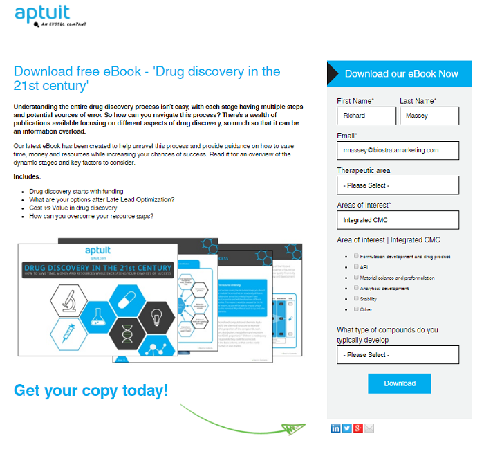
Here’s a great example of how pharmaceutical contract research organisation Aptuit successfully delivers a clear message about what their eBook offers, and how to take the next step. Their landing pages routinely achieves click-through rates upwards of 45%, well above the industry average of just 10 to 20%.
 5. Avoid distractions
What you don’t put on your page is just as important as what you do. Keep it simple. No distractions.
Remove any navigation menus and links that might be present on your other web pages. Your landing page is there for one reason only, and you don’t want your visitors doing anything other than offering their details.
6. Make it obvious
We can’t stress this enough. You want to make it as easy as possible for your visitor to take the next step. Even if that means making things blindingly obvious.
Position your lead capture form in a prominent location, one that’s clearly visible without scrolling down the page – you don’t want to make your visitor do any additional work. Typically, lead capture forms are located alongside copy (as we’ve done for our eBook campaign below).
It sounds obvious, but don’t forget to include a big, bold, brash button to submit those details. And choose your colours wisely, black on blue or white on yellow just won’t work! If your visitor clicks on one button today, make sure it’s this one.
.png?width=700&height=778&name=Landing%20page%20(2).png)
7. Show it with pictures
They say a picture is worth a thousand words, and when it comes to keeping landing pages short and sweet, graphics are your best friend. Images make it even clearer for visitors to see what they’re getting – especially if they’re glancing over your page in a hurry to access your content. So, show a picture of your eBook, or a sample of your slides. It’ll keep your prospects’ eyes on the prize and their minds firmly focused on accessing its value.
8. Ensure your content’s value justifies your form length
Ask yourself, what contact information would you be willing to give to get this content? Would you really submit your personal details for this? Be as ambitious with your request for details as the value of your content will allow. But be realistic with your expectations.
Asking for too much information isn’t just an issue of privacy, it’s also one of practicality. Filling out forms is admin work – and that’s not fun. Keep it simple, and use drop-down boxes where appropriate to make life easier. If in doubt, consider testing out what and how much you ask for, so you hit the sweet spot between obtaining the information you need and not irritating your visitor. Leading on to tip nine…
9. Test out your design
While you might have ideas about how tweaks to your landing page will improve your B2B lead generation, you won’t know unless you try them. There are lots of A/B testing software options out there, like Hubspot and Wishpond. So, go on, do the experiment!
When optimising your landing page, run one test at a time. Was it your punchier copy that made the difference, or was it the shorter lead capture form you used? Making more than one change makes it harder to pinpoint what it was that boosted lead generation.
By the way, it’s often the subtle things that make the biggest difference. After all, it’s all about keeping it simple and making it obvious.
10. Make it shareable
Customers in the life science sector put tremendous value on the trustworthiness of the content they consume, and nothing says reliable like a recommendation from a trusted peer. Social media sharing buttons not only help to maximise the reach of your content offer, they can also show how many times it’s been liked and shared. These indicators provide ‘social proof’ of its value and give your prospects yet another reason to take the next step.
But marketers beware; use social sharing buttons carefully. Small icons, carefully placed, can work well. But don’t let them distract from the core aim of your landing page: getting your visitors to enter their contact details and taking your relationship to the next level.
So, there you have it, the secrets to a successful landing page. By following these simple steps, we regularly obtain click-through rates of over 40%, double those of the industry average. Happy landings!
If you’re looking to boost lead generation as part of your life science marketing campaign, contact us by getting in touch with the team for a free consultation.