Love them or hate them, infographics are more than just the flavour of the month right now. It seems that everyone is producing them these days, taking full advantage of our desire for succinct information accessible at a glance, understandable in an instant and sharable with a click.
Some of these infographics are simply stunning, combining short, sharp snippets of information against an attractive backdrop. Others however, are doing less well: frequently cluttered, verbose and with a colour palette straight out of a pop art nightmare!
It’s not just visuals that can go awry, there’s the story, the flow, the actual copy – any of which can change an infographic from something you can’t wait to share, to a piece of work you hastily drag and drop into the Recycle Bin (that’s the Trash, Mac-users). In light of this, I thought I’d share with you some of the common mistakes I sometimes see in infographics and how you can easily avoid them.
1. Be original
Do you remember the fifth part of that action movie series loosely based on the first part, which was a bit like a much older, better film? No? Neither does anyone else. Originality is the key to being noticed and remembered. I’m not saying you can’t take inspiration from others, but don’t cross the line into the shameless plagiarism; people will notice, and then they’ll dismiss you. Don’t incessantly regurgitate old material either – look at a new infographic as an opportunity to explore new material and new designs.
2. Make it a thing of beauty
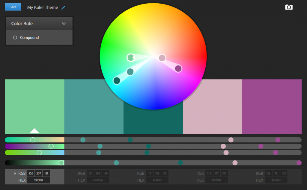
There’s no excuse for creating an ugly infographic. If you just cannot stop yourself from slapping green titles on a luminescent yellow background and then writing everything in white, there are more artistically coordinated people on hand to help. Websites like Kuler or Paletton can help you pick a whole palette – one which is simple, consistent and definitely works.
In the same vein as picking a simple, working colour scheme, keep your choice of fonts to a minimum. You may love combining Comic Sans, Curlz and Courier, but I can promise you that people will hate you for making them read it! Keep it simple, keep it legible, keep it consistent.
Oh, one more thing on looking pretty: less is often more. Don’t feel the need to fill every bit of whitespace. Infographics can quickly become cluttered if you try to cover every bit of space with copy or icons. Enjoy a little bit of space.
 An example colour palette from Kuler (Adobe)
 Typography infographic by Designmantic
3. Focus on the key messages you’re trying to deliver
You need focus. When setting out on your infographic journey, make sure you’ve mapped out where it’s going. It needs to flow from point-to-point and come to a logical conclusion. If you end up indulging in all manner of tangents, people will quickly lose interest. You want your audience to be engaged and interested, not thinking, ‘where is the chase, and how do I cut to it?’ Have a point you want to communicate, and make it as clearly and concisely as possible.
 Superpower infographic by Pop Chart Lab
4. Don’t be (too) afraid of complexity
This is a tricky one to balance and so you can forgive yourself if you don’t nail it first time around. When you’re communicating a subject that inherently relies on being detailed, like many of the highly technical scientific topics we tend to communicate about, it can be easy to omit a lot of the complexity in the hope of making your infographic more accessible. However, you run the risk of providing superficial information that doesn’t add any real value for your audience. Your infographic needs to dispense insight, which means you need to find a way to communicate complex ideas without leaving people feeling either bamboozled or patronised.
A simple way of doing this is to layer the complexity as you move through the story. Open with an introductory overview: veterans of the subject will look at it as a recap and newcomers will have the scene nicely set for them. Moving on you can add progressively more detailed information by systematically building on previous points. Progressive, simple explanations are key. To quote Albert Einstein, ‘If you can’t explain it simply, you don’t understand it well enough.’
 A section of the History of Genetics infographic by Labroots
5. Choose your source material carefully
‘Doctors say that eating chocolate cures cancer!’ may get you clicks but it won’t win you any credibility. The facts you populate your infographic with will need to be obtained from reputable sources: headlines from a tabloid newspaper are likely to raise suspicion at best and outright disbelief at worst, while a peer-reviewed journal will help to inspire confidence that you’ve carefully checked your facts.
It’s an obvious point really but you absolutely need to be sourcing your data from reliable places. It’s also important to reference this material – this ties in with point #1 above. And it should go without saying, but I'll say it again: avoid plagiarism like the plague!
If you’re working in science marketing, websites like PubMed and ScienceDirect are excellent places for finding peer-reviewed scientific publications. Be sure to choose your source material wisely before you leap in at the deep end with any bold claims! Using multiple, independent sources for each point you make is also a great way to give your story credibility.
6. Tell a visual story
Your hard work so far will rapidly come undone if your imagery isn’t up to scratch. You don’t have to throw in pictures worthy of the Tate gallery– in fact you should avoid overly detailed images – but you need imagery that is clear. A reader should be able to look at the infographic and instantly know what a particular section is about, and your selection of images will help ensure this happens. Keep the images simple and preferably more like an icon than an illustration.
7. Don’t ignore the copy
OK, you have an awesome colour scheme, you haven’t filled every pixel with images, your story is crystal clear, your imagery captures attention and you have a great selection of recent journal articles you want to cite. Awesome! It’s now hugely important to keep up your design diligence and place just as much emphasis on the actual copy as you have done on the rest of your infographic. Headlines are your first port of call and they’re more crucial than you might think: eight out of ten people don’t make it beyond a headline, so it’s important to get this part right.
Admittedly, this can be rather challenging. The trick is to put yourself in the mind of the reader – I imagine you probably are a reader and so this should be a breeze! Think to yourself, ‘Would I click on that?’ ‘Would I read that?’ ‘Would I share that?’
Writing good headlines is simply a matter of writing concise copy while simultaneously dangling the carrot of information behind it: people want to know that they’re going to learn something. You can build on this and add a little provocation to the title – don’t be rude, but emotive words are much more likely to elicit a response than bland ones.
While you can play it a little loose with the truth to attract attention, it’s very important you don’t lie! Titling your piece the ‘Top 10 movies of 2013’ and then writing an essay about why you think Fast & Furious 6 deserved an award isn’t going to win you any fans. Don’t make promises in your headlines that you can’t keep; delivering on a headline is just as important as writing a great one.
When it comes to the rest of the copy, don’t be overly verbose. If you can say something in ten words don’t use twenty! In fact, I often write the copy for the first draft of an infographic and then challenge myself to cut it in half. You only have a limited space on an infographic for copy, so make sure the text counts.
 A Diagrammatical Dissertation on Opening Lines of Notable Novels from Pop Chart Lab
Wrapping it up
There we have it, seven key pieces of advice to help you make your infographics awesome: have an original idea and layout; don’t indulge your personal colour and font fetishes; have a clear point and make it; educate the audience; use reliable sources of information; utilise punchy images; and don’t ramble!
Work with us on an infographic
As you can probably tell, we love using infographics to tell compelling stories – especially about science. If you’d like to find out how we might work together to tell your story in a visually interesting way, get in touch – we’d be happy to share some examples of recent infographics we’ve worked on to help stimulate our collective imaginations.